
You’ve spent hours crafting the perfect presentation, but did you know that less is often more when it comes to slide design? In this article, we’ll explore why simplicity is key to engaging your audience and delivering a memorable message. So grab your favorite beverage, and let’s dive into the world of minimalist presentations.
The Perils of Text-Heavy Slides
One common mistake my clients often make is cramming too much text onto a single slide. This can be a major distraction, as audience members end up reading the text instead of listening to the presenter. Remember, slides are meant to be visual aids, not pages from a book or an article. By including less text on your slides, you’re actually showing that you know your stuff!
Take a cue from Steve Jobs and embrace simplicity. If you want to provide more detailed information, put it in the notes section of your slides so that your audience can refer to it later.
Hook Your Audience: Less Text, More Engagement

Your goal as a presenter is to hook your audience and make them pay attention to you. Don’t give them a paragraph to read on a slide – that’s what you’re there for! By including just enough text to pique their interest, you’re encouraging your audience to focus on your words and ideas, rather than the slides themselves.
Effective Communication: The Power of Brevity
When it comes to communication, less is often more. A concise, well-crafted message can be more impactful than a lengthy, rambling explanation. The best communicators are those who can express complex ideas in just a few words, demonstrating a deep understanding of their subject matter.
The Designer’s Dilemma: Striving for Symmetry
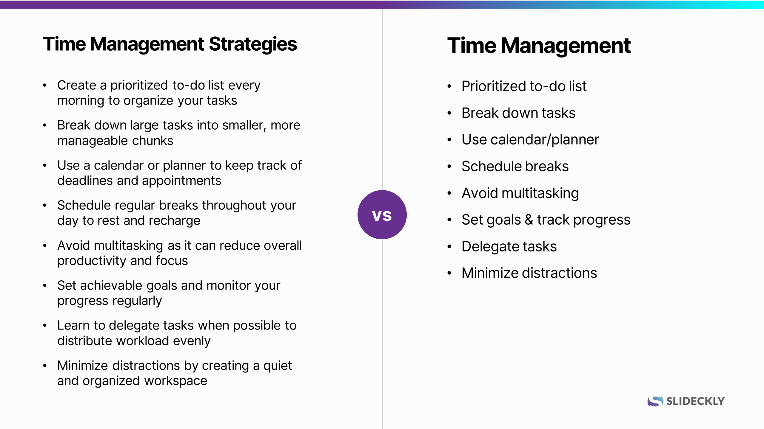
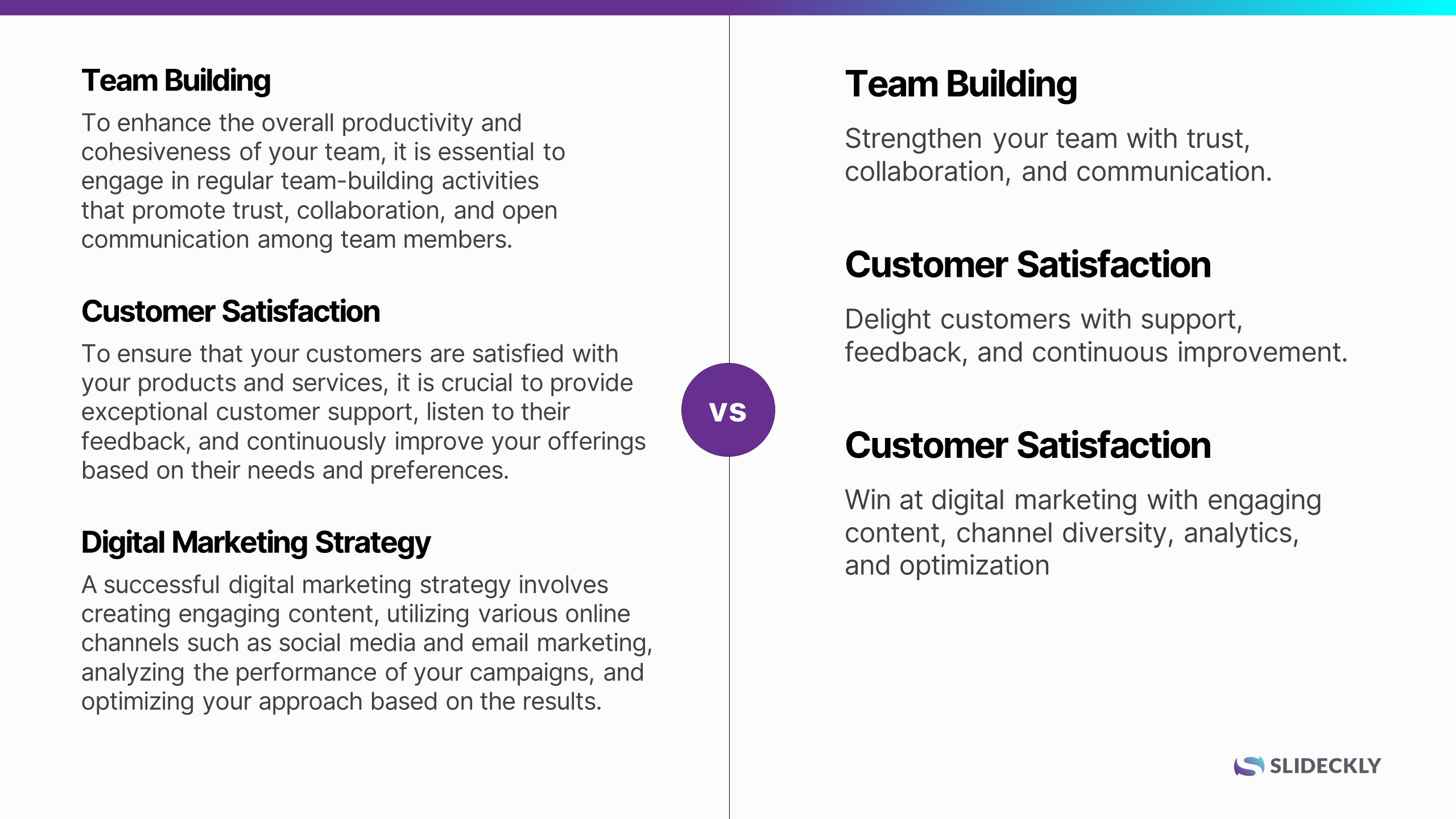
As a designer, I often notice that clients struggle with achieving symmetry in their copy. For instance, if you have three columns with text, you might see one sentence in the first column, one sentence in the second column, and five sentences in the third column. This lack of balance can make it difficult to create an impactful layout. By keeping your text concise and evenly distributed, you’ll make your designer’s life easier and your presentation more visually appealing.
Less Words, More Knowledge

Don’t assume that using fewer words means you know less about your subject. In fact, the opposite is true. By refining your text and distilling your key messages, you’re demonstrating a deeper understanding of your topic. This exercise will not only improve the visual appeal of your slides but also help you become a more effective communicator.
The power of simplicity in presentations cannot be overstated. By embracing a “less is more” mentality, you’ll create engaging, visually appealing slides that resonate with your audience. So the next time you’re crafting a pitch deck, sales deck, training deck, or keynote speech, remember that brevity is your friend – and the key to unlocking the full potential of your presentation.
The Wisdom of the Greats: 5 Quotes on Simplicity
To further drive home the importance of simplicity, here are five quotes from some of history’s most influential individuals, emphasizing the value of keeping things simple, especially in presentations and communication:
“Simplicity is the ultimate sophistication.”
Leonardo da Vinci
“If you can’t explain it simply, you don’t understand it well enough.”
Albert Einstein
“Don’t use a five-dollar word when a fifty-cent word will do.”
Mark Twain
“Short words are best, and the old words, when short, are best of all.”
Winston Churchill
“That’s been one of my mantras — focus and simplicity. Simple can be harder than complex; you have to work hard to get your thinking clean to make it simple. But it’s worth it in the end because once you get there, you can move mountains.”
Steve Jobs
Let these words of wisdom from these great minds inspire you to embrace simplicity in your presentations and communication, allowing you to create a lasting impact on your audience.