Designing a visually engaging presentation is crucial to capturing and holding your audience’s attention. No matter how interesting or valuable your content may be, if it’s presented in a boring or unappealing way, your audience is likely to tune out. In this article, we’ll share some tips and best practices for designing visually engaging presentations that will keep your audience engaged and interested from start to finish.
1. Keep it simple
One of the most important principles of visual design is to keep it simple. This means avoiding cluttered or busy layouts, excessive text, or distracting graphics. Instead, focus on creating a clean, minimalist design that emphasizes your key messages and ideas.
A simple design will not only make your presentation more visually appealing, but it will also help your audience to focus on the most important information and understand it more easily.
2. Use visual aids
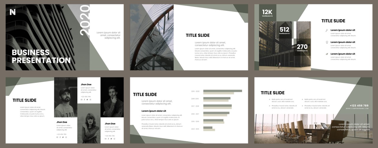
Visual aids such as images, charts, and graphs are a powerful way to engage your audience and communicate complex information more effectively. They can help to break up long blocks of text, add variety and interest to your presentation, and make your message more memorable.
When using visual aids, be sure to choose high-quality, relevant images and graphics that support your message and add value to your presentation. Avoid using stock images that are overused or generic, as these can make your presentation look amateurish or uninspired.
3. Use color strategically
Color is another important element of visual design that can have a big impact on the effectiveness of your presentation. By using color strategically, you can create a more visually appealing and memorable presentation, and help to emphasize key points or messages.
Use color strategically and follow brand guidelines: When using color in your presentation, it’s important to be strategic and intentional. Consider your company’s brand guidelines and incorporate those colors into your presentation. Consistency in color usage can help reinforce your brand identity and make your presentation feel more cohesive.
4. Consider typography
Typography, or the choice of fonts and text styles, is another important aspect of visual design that can affect the readability and impact of your presentation. Use clear, easy-to-read fonts that are appropriate for your audience and message, and be consistent in your use of font styles and sizes.
Avoid using too many different fonts or font styles, as this can make your presentation look cluttered or confusing. Instead, choose a few key fonts that complement each other and use them consistently throughout your presentation.
Choose typography carefully and follow brand guidelines: Just as with color, typography is an important visual element in your presentation. Make sure to choose a font that is easy to read and matches the tone and style of your presentation. It’s also important to follow your company’s brand guidelines for typography and use consistent fonts across all of your company’s materials. This will help ensure consistency in your brand’s messaging and visual identity.
5. Use animation and transitions sparingly
While animation and transitions can add interest and variety to your presentation, they can also be distracting or annoying if overused or used inappropriately. Use animation and transitions sparingly and strategically, to emphasize key points or to make transitions between sections more seamless.
When using animation or transitions, be sure to choose effects that are appropriate for your message and audience, and avoid using too many different effects or styles. Keep it simple and consistent, and focus on using animation and transitions to enhance your message rather than distract from it.
Designing visually engaging presentations is a key skill for any presenter or communicator. By following these tips and best practices, you can create presentations that are not only visually appealing, but also effective in communicating your message and engaging your audience. Remember to keep it simple, use visual aids, use color strategically, consider typography, and use animation and transitions sparingly. With a little effort and attention to detail, you can create presentations that are both visually stunning and highly effective.