
Are your presentations putting your audience to sleep? It could be because you’re making one of these 12 common presentation design mistakes. But don’t worry, we’ve got you covered with some helpful tips to avoid them!
1. Boring Templates
Don’t let your presentation look like it was made in the Stone Age. Choose a modern template that will make your audience sit up and take notice.


Key takeaway: If your presentation looks like it was made in the 90s, your audience will be stuck in the past instead of focused on your message. Time to update, Marty McFly!
2. Cluttered Slides
Too much information can be overwhelming and distract your audience. Keep it simple and stick to the essentials.
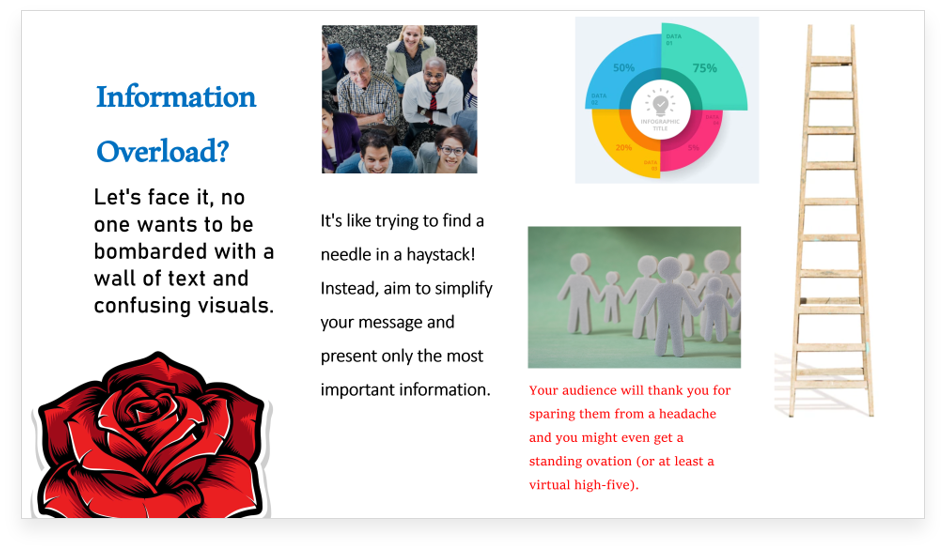

Key takeaway: A cluttered slide is like a messy room – it may have everything you need, but it’s hard to find anything!
3. Small Text
No one wants to squint to read your presentation. Make sure your font size is big enough for everyone to read comfortably.
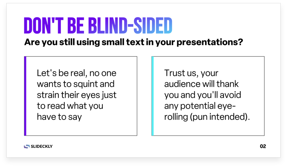
Key takeaway: Less is more, unless you’re writing a text message to your ex.
4. Lack of Contrast
If your text and background colors are too similar, it can be hard to read. Make sure there’s enough contrast to make your text pop.
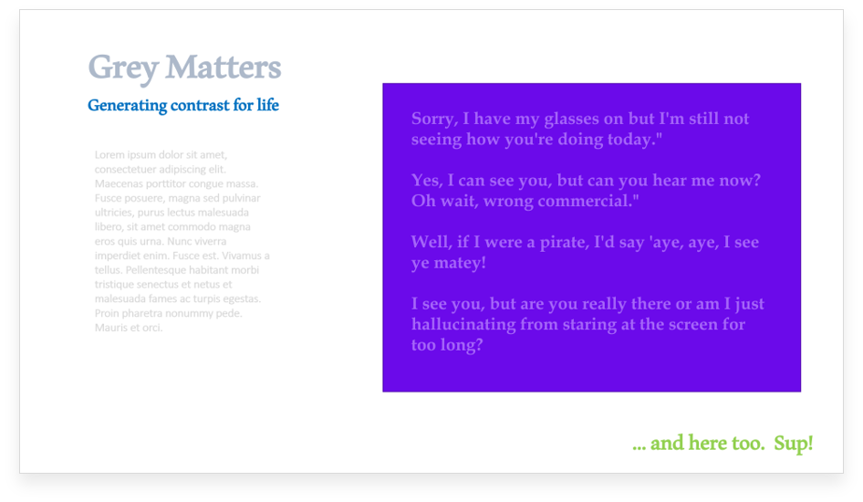
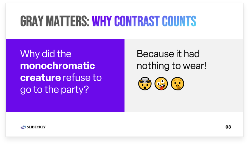
Key takeaway: If your slide lacks contrast, your audience might need a pair of glasses or a search party to find your message.
5. Inconsistent Design
Stick to a consistent design throughout your presentation to avoid confusion. Don’t mix and match different fonts, colors, and layouts.

Key takeaway: Design consistency is like a box of chocolates, you never know what you’re gonna get on the next slide.
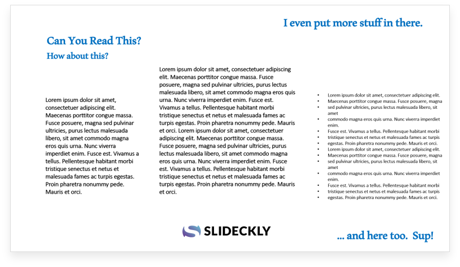
6. Too Many Bullet Points
Don’t turn your presentation into a bullet-point nightmare. Use visuals, images, and graphs to help break up the text.
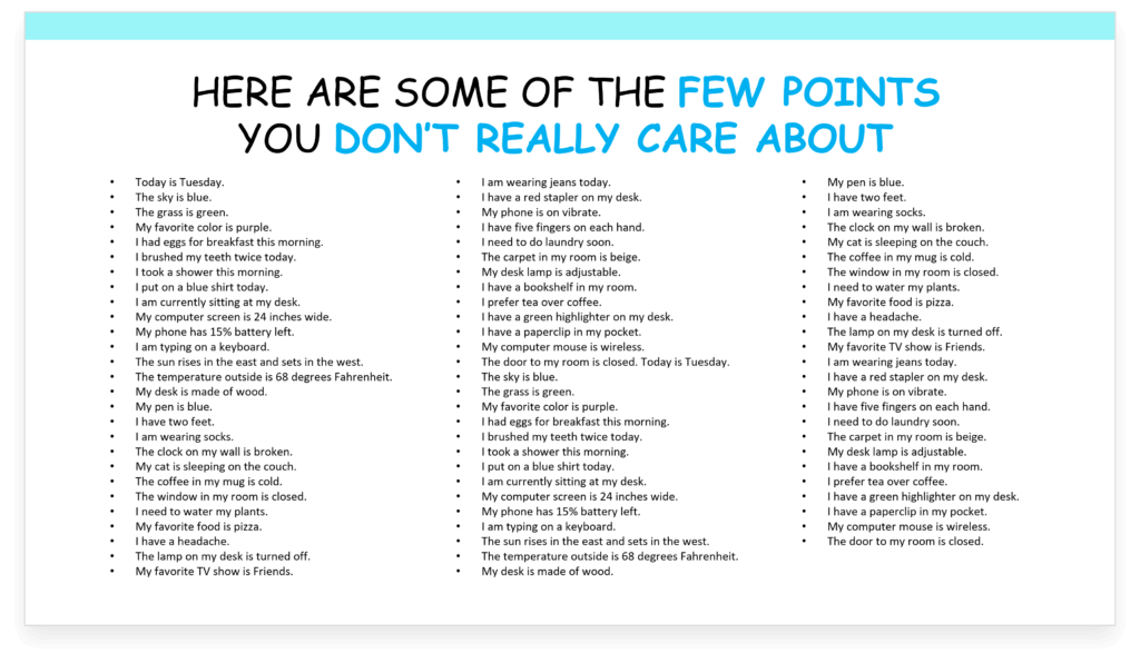
Key takeaway: Bullet points are like spices, too much can ruin the dish.
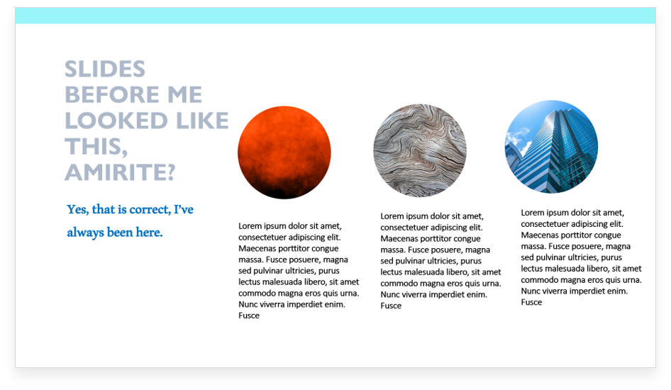
7. Overused Clipart
Clipart might have been cool back in the day, but now it’s just cheesy. Try to find high-quality images and graphics instead.

Key takeaway: Using clipart on your slides is like bringing a kazoo to a symphony orchestra.
8. Poor Image Quality
Blurry or pixelated images can ruin the look of your presentation. Make sure your images are high-resolution and look sharp.


Key takeaway: A pixelated picture is worth a thousand apologies.
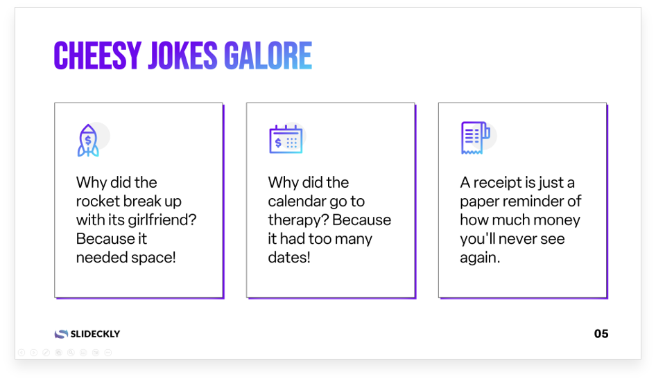
9. Reading from Slides
Don’t read word for word from your slides – engage with your audience. Use your slides as a visual aid, not a crutch.

Key takeaway: Reading words directly off your slides can make your audience wonder why they’re even there, especially if they can read faster than you can speak.
10. Lack of Visuals
Add in visuals like graphs, charts, and images to keep your audience interested. A picture is worth a thousand words!


Key takeaway: A slide without visual elements is like a joke without a punchline – it may have potential, but it falls flat without the right delivery.
11. Using the Wrong Fonts
Choosing the wrong font can be a big mistake. Stick to fonts that are easy to read and avoid using too many different fonts in one presentation.
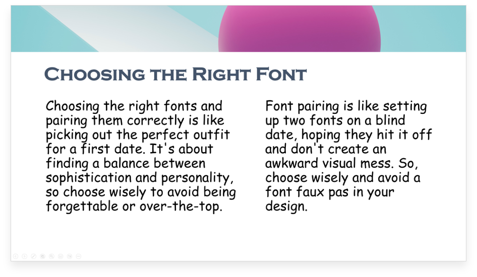
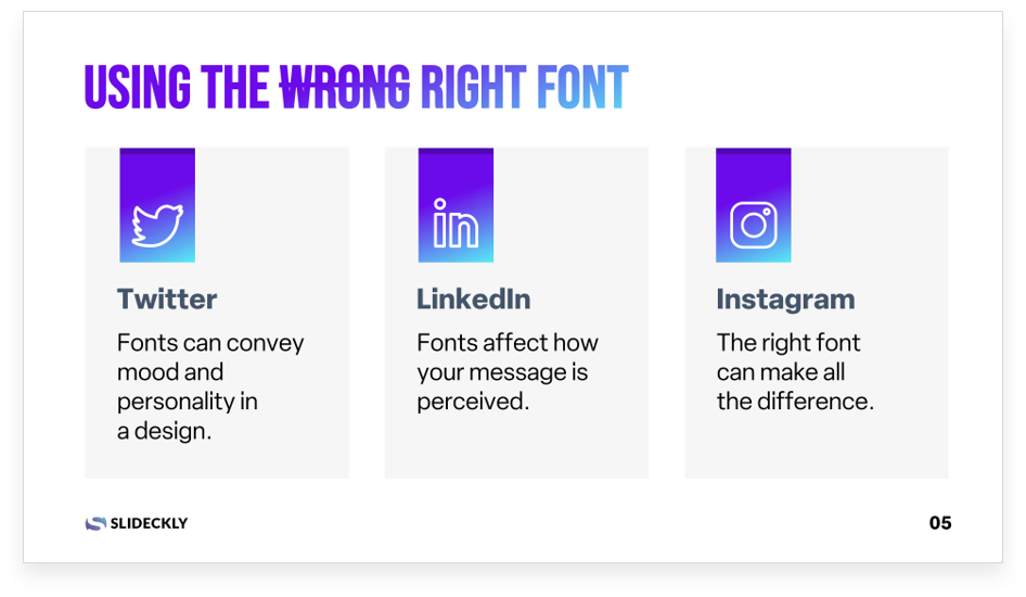
Key takeaway: Choosing a bad font for your presentation is like wearing a clown suit to a job interview – it might be memorable, but for all the wrong reasons.
12. No Call to Action
End your presentation with a clear call to action so your audience knows what to do next. Whether it’s signing up for your newsletter or making a purchase, make sure your audience knows what the next steps are.


Key takeaway: Forgetting to include a call to action on a slide is like setting up a bowling pin without aiming for a strike.
Avoiding these common presentation design mistakes can help take your presentations to the next level. So go forth and wow your audience with your newfound design skills!